I live in rural New Brunswick which provides most of the subject matter of my paintings. I have a three-wheeled bicycle with a large basket on the back where I can store my paints, a chair and a table and anything else needed. When I am painting, I am in a world of pure concentration. My goal is to create spontaneous, balanced and authentic works of art with the hope that people who see my art will feel the same kind of pleasure that I do.
Dear lord mother! She looks like a hideous ogre that's about to vomit!
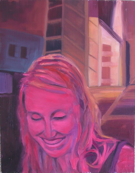
Definitely liked the first one better.
I got your e-mail, and I wouldn't worry too much about getting her features exactly right - just as long as she doesn't look hideous. that would make for a bad birthday present. the first one is good though.
thanks for doing this Mom, I know I'm going to be a real pain in the ass. Love you.
Just re-read my post, sorry to be so flippant. In some ways the 2nd one is more like her face, but it's a little too squashed. Perhaps a slightly idealized portrait is not such a bad thing (I would say the first one is slightly idealized).
What if you didn't centre her face? What if her face is kind of off to the side like in the photgraph? And the perpective lines come on through the image - into blackness.
Also, I think her neck is too articulated in both paintings, it should kind of fade a bit.
Lord that's it - I'm keeping my mouth shut - architects, we're way too critical.
Okay, this is the new, improved version. I hope it is satisfactory. I don't know if I can do it again; however, any suggestions on improving this picture will be welcome.
4 comments:
Dear lord mother! She looks like a hideous ogre that's about to vomit!
Definitely liked the first one better.
I got your e-mail, and I wouldn't worry too much about getting her features exactly right - just as long as she doesn't look hideous. that would make for a bad birthday present. the first one is good though.
thanks for doing this Mom, I know I'm going to be a real pain in the ass. Love you.
Evan
Just re-read my post, sorry to be so flippant. In some ways the 2nd one is more like her face, but it's a little too squashed. Perhaps a slightly idealized portrait is not such a bad thing (I would say the first one is slightly idealized).
What if you didn't centre her face? What if her face is kind of off to the side like in the photgraph? And the perpective lines come on through the image - into blackness.
Also, I think her neck is too articulated in both paintings, it should kind of fade a bit.
Lord that's it - I'm keeping my mouth shut - architects, we're way too critical.
Hope this is still fun.
Evan
Okay, this is the new, improved version. I hope it is satisfactory. I don't know if I can do it again; however, any suggestions on improving this picture will be welcome.
her face definitely looks pretty close. It doesn't quite have the same mysterious quality that the first one had, but it looks more like her.
It's a little difficult to tell the colors. I like the darkness of the background in the first one as well.
How do you like it? I say if you like it let's do it - please send it to me when you are done. I can pay for it on my credit card.
Thansk so much for doing this Mom. She'll love it.
evan
Post a Comment